Stocks: Sectors
- Energy
- Materials
- Industrials
- Consumer Discretionary
- Consumer Staples
- Health Care
- Financial
- Technology
- Utilities
Futures
Benchmarks
Forex
Industries
Comparative
Seasonal Start
Economic Data
Sanofi SA (NASD:SNY) Seasonal Chart
Seasonal Chart Analysis
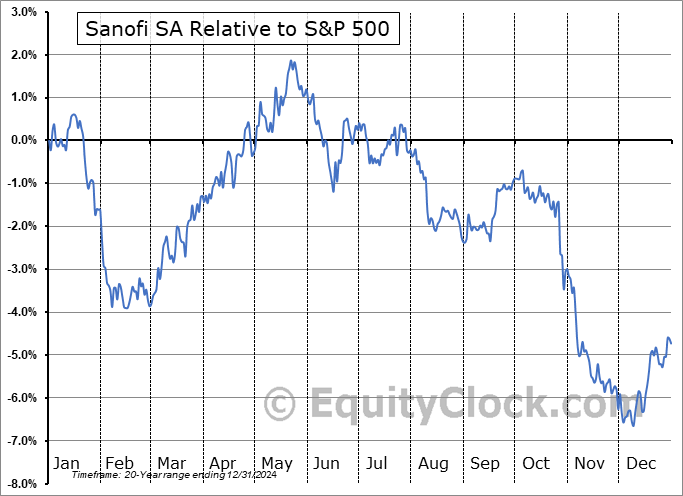
Analysis of the Sanofi SA (NASD:SNY) seasonal charts above shows that a Buy Date of February 28 and a Sell Date of May 21 has resulted in a geometric average return of 4.36% above the benchmark rate of the S&P 500 Total Return Index over the past 20 years. This seasonal timeframe has shown positive results compared to the benchmark in 16 of those periods. This is a very good rate of success and the return strongly outperforms the relative buy-and-hold performance of the stock over the past 20 years by an average of 10.99% per year.
The seasonal timeframe is Inline with the period of seasonal strength for the Healthcare sector, which runs from April 25 to December 4. The seasonal chart for the broad sector is available via the following link: Healthcare Sector Seasonal Chart.
Sanofi engages in the research, production, and distribution of pharmaceutical products. It operates through the Biopharma segment, which comprises commercial operations and research, development and production activities relating to the specialty care, general medicines and vaccines franchises plus support and corporate functions, for all geographical territories. The company was founded in 1973 and is headquartered in Paris, France.
 To download SNY seasonal chart data, please log in or Subscribe.
Stocks mentioned in this post: SNY
Symbols by Letter: A | B | C | D | E | F | G | H | I | J | K | L | M | N | O | P | Q | R | S | T | U | V | W | X | Y | Z
|
|


